
Walnut floors work best with seven strategic wall colors: warm off-whites like Swiss Coffee reflect light and enhance warmth; soft greige (Sherwin-Williams Agreeable Gray) balances beige and gray beautifully; sage green adds organic softness; light gray lets walnut shine; deep navy creates elegant contrast; slate blue adds cooler depth.
Test all samples under daylight, lamplight, and overhead lighting first—walnut’s undertones shift dramatically. This approach prevents mismatches.
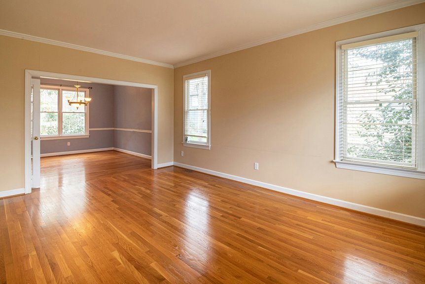
The full guide covers specific paint names and lighting strategies.
Why Walnut’s Undertones Change Under Different Lights

Ever noticed how your walnut floors look different in morning sunlight versus evening lamplight?
Walnut floors shift from warm gold in daylight to cool purple tones under evening lamplight, transforming your room’s entire look.
Walnut undertones shift dramatically based on lighting conditions. Your wood displays red, gold, chocolate, or purple notes depending on what light hits it. Daylight reveals warm undertones most clearly. Artificial light often brings out cooler purple or gray tones instead.
This matters for color harmony. You’re choosing wall colors that complement your floors, so understanding these shifts is important. Test samples next to your walnut under multiple lighting scenarios. Compare them in daylight first, then under your room’s overhead and lamplight. Notice which undertone dominates in each setting.
This practical approach prevents costly mistakes. You’ll confidently select wall colors that work across all your dining room’s lighting conditions.
Warm Off-Whites: The Best Walnut Floor Backdrop
Warm off-whites create an ideal backdrop by offering soft contrast while reflecting light throughout your dining space. Creamy shades like Benjamin Moore Swiss Coffee and Sherwin-Williams Ivory Lace enhance walnut’s warmth without competing for attention. These colors work because they harmonize with walnut’s natural undertones, keeping your floors as the room’s focal point.
Soft Contrast & Light Reflection
Warm off-whites and creamy neutrals work well for dining rooms with walnut floors. These soft contrast choices reflect natural light effectively, making your space feel larger while maintaining cozy warmth.
Why Creamy Off-Whites Work Best
Creamy off-whites complement walnut’s deep brown and golden undertones. They brighten dining areas without competing with your floors. Benjamin Moore Swiss Coffee and Sherwin-Williams Agreeable Gray are solid options.
Enhancing Light with Strategic Design
Light greiges—blending gray and beige—provide balanced backdrops that reduce heaviness. Pair warm neutrals with a bright white ceiling and trim contrast. This approach keeps your walnut’s richness as the main visual element while maximizing light reflection throughout the room.
Warm Undertone Harmony
Warm Off-Whites That Work
Warm undertones in off-white paint create the perfect backdrop. Sherwin-Williams Agreeable Gray and Benjamin Moore Swiss Coffee both showcase walnut’s red and amber tones. These creamy whites reflect light while preserving the floor’s richness.
Beyond Pure Whites
Greige balances warmth and modernity, preventing walnut from feeling heavy. Light tan and beige options like Behr Even Better Beige echo the floor’s caramel undertones.
Framing Your Floors
Strategic trim and ceilings matter too. Crisp white trim and white ceilings enhance your warm backdrop without competing with walnut’s depth. This approach frames your investment beautifully.
Soft Greige: Blending Warmth With Modern Sophistication

Soft greige works beautifully with walnut floors because it combines warm beige and cool gray tones, creating visual balance without overwhelming your space. This color choice pairs modern sophistication with the warmth your walnut furniture inherently brings, making it ideal whether you prefer traditional or contemporary dining sets. To achieve this look, consider paint options like Sherwin-Williams Agreeable Gray or Benjamin Moore Revere Pewter, then layer in warm metallics and muted cool accents to echo your wood’s rich caramel and espresso undertones.
Warmth Meets Contemporary Style
When you’re seeking a dining room color that honors walnut’s richness without feeling dated, soft greige delivers a practical solution. This balanced blend of gray and beige complements walnut floors’ warm caramel and espresso tones perfectly. You’ll want to incorporate green undertones or muted blue-greens for contemporary contrast while keeping walnut as your room’s rich ground. Light-reflective greige shades with cream undertones brighten your dining space and maintain the floor’s depth throughout the day. Test your greige swatches under both natural light and artificial lighting to verify walnut’s warmth remains visible. Avoid stark whites or dark charcoal wall colors, which disrupt the subtle modern harmony you’re building. This approach creates the sophisticated, cohesive dining environment you’re looking for with walnut floors.
Creating Visual Balance
Soft greige solves the balance problem that stark colors create: it honors walnut’s richness while keeping your dining room feeling current. This neutral blend prevents your walnut floors from competing with wall colors for attention. Instead, greige establishes harmony through subtle contrast.
Your color palette gains depth when greige walls let walnut’s undertones show. The greige absorbs light differently than pure gray or beige alone. This creates ambience without overwhelming the space.
Test samples under both natural and artificial lighting. Watch how greige responds to morning sun and evening fixtures. You’ll notice the walnut’s red, gold, or chocolate undertones appear distinctly.
Designer tip: Sherwin-Williams Agreeable Gray and Benjamin Moore Revere Pewter deliver this balance consistently. Both options preserve visual interest while maintaining your sophisticated dining environment.
Pairing With Walnut Tones
How do you choose a wall color that won’t fight with your walnut floors? Soft greige offers the solution you’re seeking. This balanced blend combines warm beige undertones with subtle gray, creating a complementary palette that lets your walnut floors stand out.
Why greige works:
- Harmonizes with walnut’s caramel and espresso tones while maintaining modern sophistication
- Keeps your space feeling bright and contemporary rather than heavy or dated
- Supports both traditional and contemporary design styles effectively
Designer-recommended options:
Sherwin-Williams Agreeable Gray and Benjamin Moore Revere Pewter are trusted greige choices. Both provide warm contrast against walnut without overwhelming the room.
Critical consideration: Test your greige selection under different lighting effects. Daylight and artificial lighting shift perceived warmth differently, affecting contrast balance significantly.
Sage Green With Walnut: Organic Elegance Without Coldness

Why does sage green work so well with walnut floors? Sage provides softness without introducing coldness. You’re combining muted green tones with walnut’s warm caramel and espresso undertones, creating balance.
Specific Color Selections
Benjamin Moore Saybrook Sage and Sherwin-Williams Clary Sage offer proven options. Both deliver subdued green backdrops that harmonize naturally with your wood.
Creating Layered Contrast
Your sage walls serve as anchors. Layer deeper forest green accents through artwork and heavier textiles. Add lighter seafoam elements in throw pillows and accessories for dimensional interest.
Testing Your Choice
Sample swatches under natural and artificial lighting. Observe how the green undertone interacts with walnut throughout the day. This maintains warmth and cohesion across varying light conditions, supporting an earthy, grounded aesthetic suited for casual, organic, or rustic schemes.
Deep Navy and Slate Blue: Rich Contrast

Deep navy and slate blue create striking contrast with walnut’s warm tones. These sophisticated wall colors bring elegance to your dining room while grounding the entire design.
Why These Colors Work Together:
- Navy shades anchor your space, providing year-round elegance that photographs beautifully
- Slate blue offers cooler tones that enhance depth without overwhelming your walnut floors
- Both colors highlight the natural grain in warm wood, creating visual interest
Navy blue and slate blue complement walnut by providing sophisticated backdrops. Adequate lighting becomes essential—brighten dark walls with proper fixtures. Incorporate lighter furniture and accents to prevent heaviness. Avoid glossy finishes on walls; matte or eggshell textures maintain balanced sophistication.
This wall color strategy keeps your dining room inviting while celebrating walnut’s caramel and espresso tones.
Light Gray: Let Walnut Take Center Stage

Sometimes the simplest choice makes the biggest impact. Light gray walls create the perfect backdrop for your walnut floors to shine.
Choosing the Right Gray
Benjamin Moore Classic Gray and Sherwin-Williams Misty offer crisp contrast that highlights walnut’s warm caramel and espresso tones. Consider light gray with green-gray undertones like Sea Haze for organic balance. These walnut pairings preserve depth without overpowering richness.
Testing Your Dining Room Color
Testing samples in natural and artificial lighting matters. You’ll verify the gray enhances rather than dulls your floors.
Completing the Look
Pair light gray walls with warm neutrals and off-white trim. This approach maintains brightness while preserving walnut’s warmth. Add navy or slate accents sparingly for drama against your light gray backdrop. The result: a sophisticated dining room where walnut becomes the main visual element.
Test Samples Before Painting (And Avoid These Mistakes)

You’ve narrowed down your color choices, but picking the right shade requires one critical step: testing paint samples directly in your dining room.
Large swatches reveal how undertones interact with walnut floors across different times of day. Observe your color swatches under:
- Daylight to see true undertones without artificial influence
- Lamplight to check warmth shifts that affect the overall feel
- Overhead lighting to check consistency throughout evening gatherings
Paint big sections, not small cards. Leave samples up for several days. Watch how walnut grain movement and furniture reflections influence perception. Compare white trim options—crisp whites like Benjamin Moore Simply White—against your swatches to confirm intentional contrast exists.
Avoid monochromatic mistakes by choosing subtle contrast instead of matching walnut’s tone exactly. Testing prevents costly repainting and keeps your color balanced across all lighting conditions.